TrackTik Help Center
Empowering users to go on a self-help journey
USER RESEARCH, ANALYTICS, VISUAL DESIGN, ILLUSTRATION
Project type: Responsive Support Site
Company: Trackforce + TrackTik
Role: Sole Product Designer
Industry: Physical Security Software
Tools: Figma, Zendesk, Google Analytics,
Adobe Illustrator, Photoshop, Procreate
Duration: Q2 2021 - Q3 2021
Project background
Our support site was not meeting the needs of our users, and this was resulting in a large amount of support tickets being submitted, many of whose solutions were covered in our support articles. I was brought into this project along with a content designer from my design team, where we worked closely with the Client Support Team Manager and his team to bring about a best-in-class support experience.
The site remains mostly unchanged; you can view it here.
The goal
Make our support site more intuitive to promote self-service and improve ticket deflection, along with a visual overhaul.
Starting point
We started with a competitive audit, drawing inspiration from leading help centers like Zendesk, Atlassian, and Adobe to compare their support offerings to ours. This helped us identify some standard best practices, such as featured articles, popular search suggestions, and dynamic FAQs based on article view counts. Our help center was about 8 years old at the time, so it was in desperate need of a revamp.
We didn’t rely solely on assumptions though; we made decisions based on data collected from Google Analytics, including bounce rates and heat maps. While it wasn’t a perfect process, we were confident that our work was moving our help center in the right direction.
Overall navigation issues
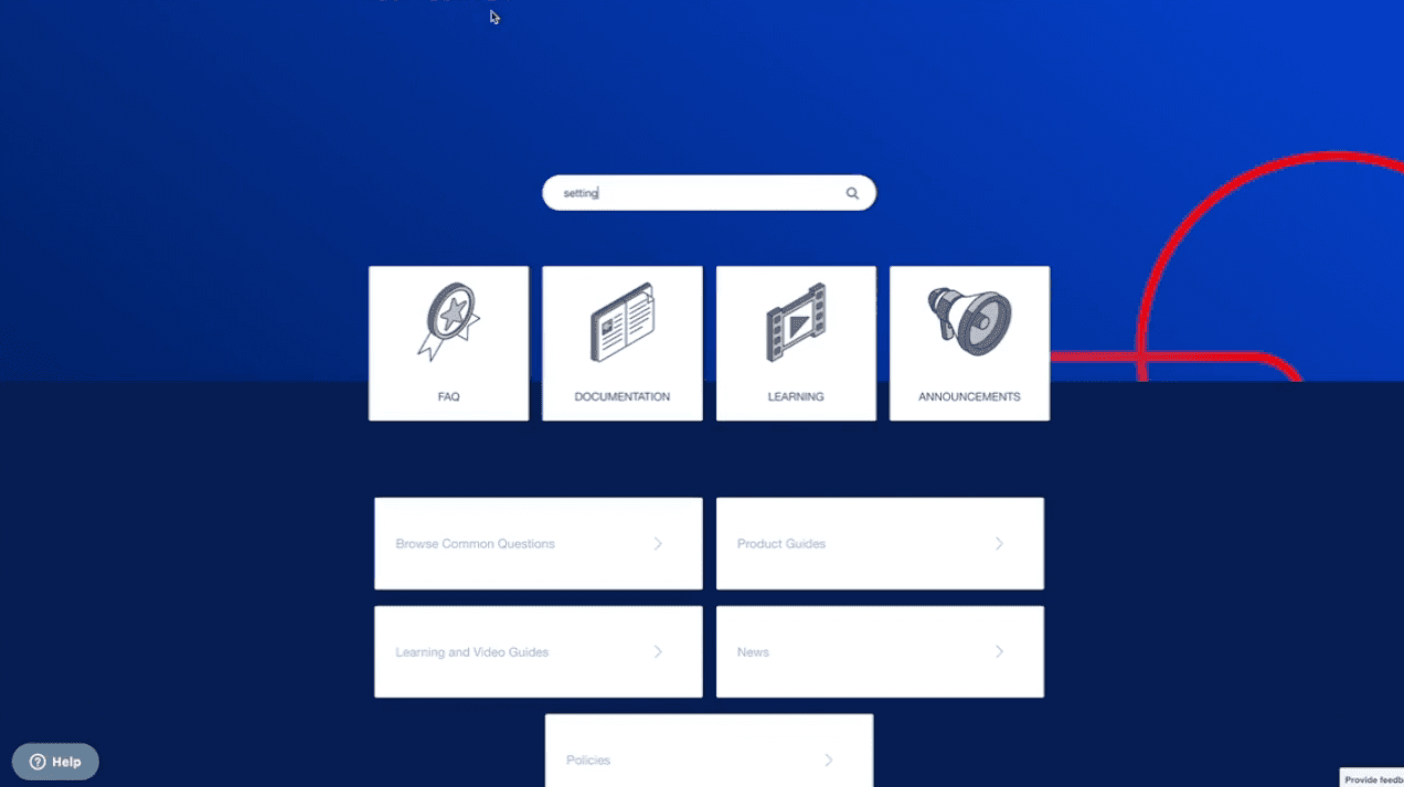
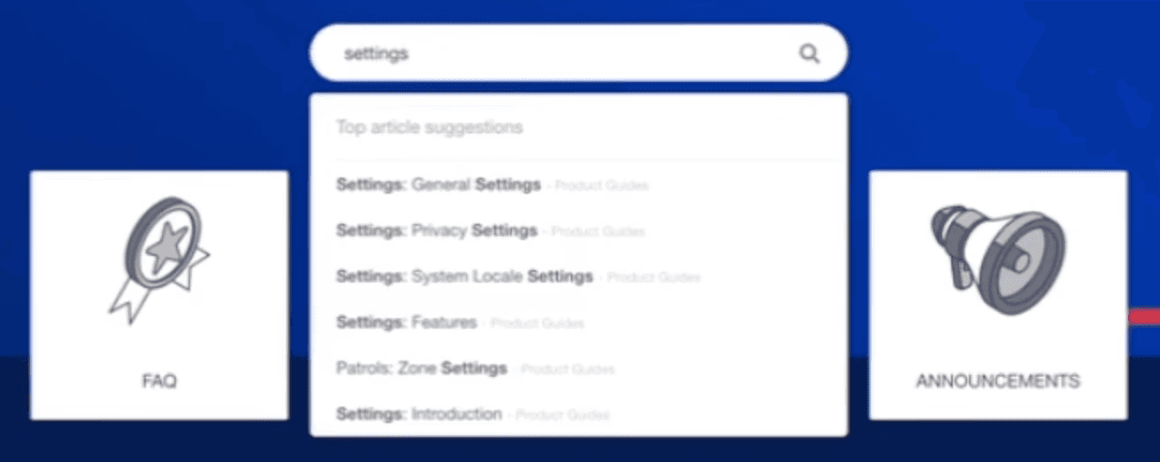
This was the most glaring issue with the help center. We had four categories: FAQs, Documentation, Learning, and Announcements, which contained every help center article across five different modules. But what if a user had a specific module they wanted to learn about? They would have to try and search for it. The issue was that our search results only provided the article title along with its category, which was generic. This meant a user had to click on a search result and read the first few paragraphs to know if their solution was in that article. Additionally, any typos made in the search query would not bring up any results, which can be frustrating for non-native English speakers—a large portion of our end-users in the USA.
As you can see, it would be much easier for a user to simply submit a ticket at this point.
Below are some snippets of the site before it was redesigned (please forgive the low resolution).
"How might we…"
Most efficiently lead our users to relevant support articles?
Improved article categorization
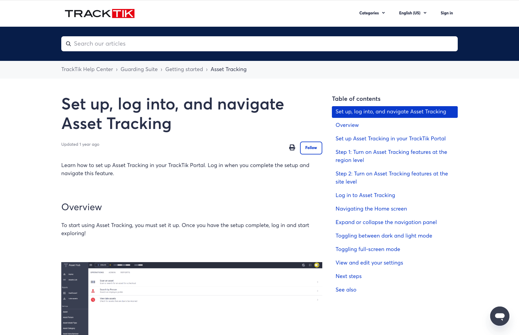
With over 100 articles, we knew we needed better organization. We started by creating new categories, separating articles by their modules. This would not only improve the search experience but also help with manual navigation through the site via category links on the landing page.
Each module in our product would have its own pseudo home page, with three general sections for their respective articles: "Getting started," "Using [Module Name]," and "Troubleshooting." This would help users narrow down their searches within the module they were using.
Better theme for easier navigation
Along with the articles being difficult to find, they were also hard to navigate. There was no table of contents, so users couldn't quickly jump between sections. If the article was long, users had to either skim through it or use Ctrl+F to search for keywords. Neither option was user-friendly, so I knew we needed to update our theme with more robust features.
After some research, I found a theme provider called Lotus Themes. They offered great features like a Table of Contents, better article formatting, and “Popular searches” underneath the search bar. These simple quality-of-life features made the content more accessible and easier to digest for our users.
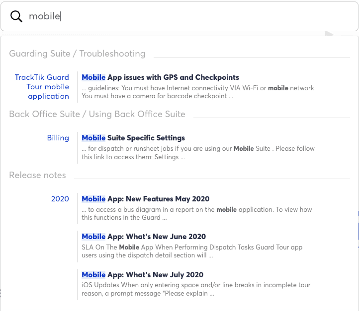
More relevant autocomplete
Using heatmaps, we identified that users were using the search bar more than our category links. So, we knew that to make their lives easier, we had to invest in a search experience that provided more accurate results, even before they clicked on a search suggestion.
After exploring different options, I decided that Algolia was the perfect tool. It crawled our Zendesk library for all our articles and organized them more intuitively than our current site. It included category headers and article snippets where the search query matched, as well as smart autocomplete that considered typos.
This was a big win for our team and likely the most significant improvement to the support site overall.
The design

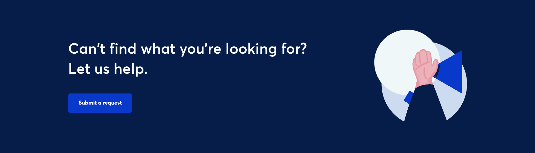
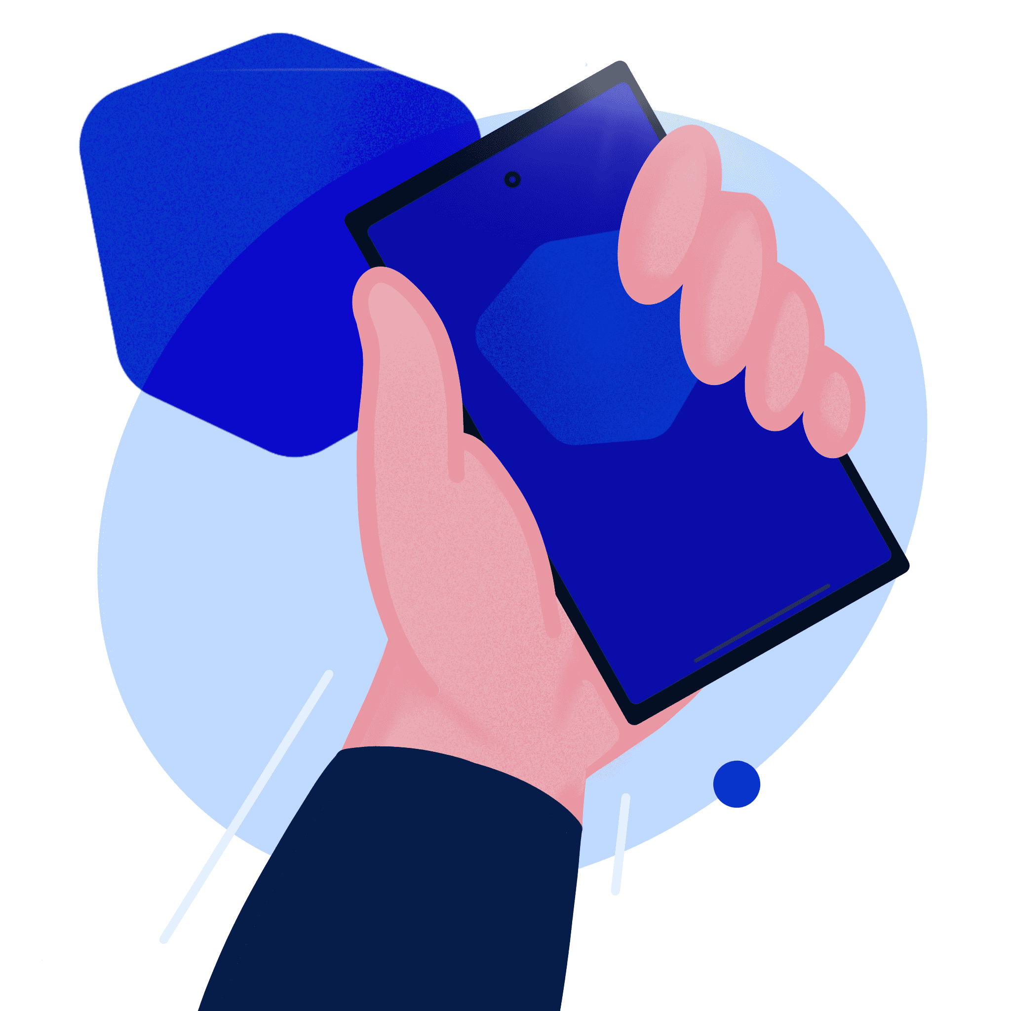
With a background in graphic design, I love having the creative freedom to take things in new directions. Even now, designing the product is the part that excites me the most. We were working with a Zendesk theme, so the structure was simple, but I had complete freedom over the design assets, so I spent some time sketching in Procreate to come up with some illustrations.
I aimed to keep the site professional, recognizing that the average user of our product was between 30-55 years old, but I also wanted to make it inviting and personable, given the fact that if you were navigating to the support site, there's a chance you're frustrated or in need of help. Blue is known to be a calming colour, so I leaned heavily into that colour palette.
The illustrations were well-received by the company and remain on the site today.
After designing the site layout in Figma, I handed off the designs to the developers at Lotus Themes. We went back and forth a few times on some minor design challenges, but overall, we achieved what we set out to do.