Project type: End-to-end app
Company: Trackforce + TrackTik
Role: Sole Product Designer
Industry: Physical Security Software
Tools: Figma, JIRA, MS Teams, Miro
Duration: Q2 2022 - Q2 2024
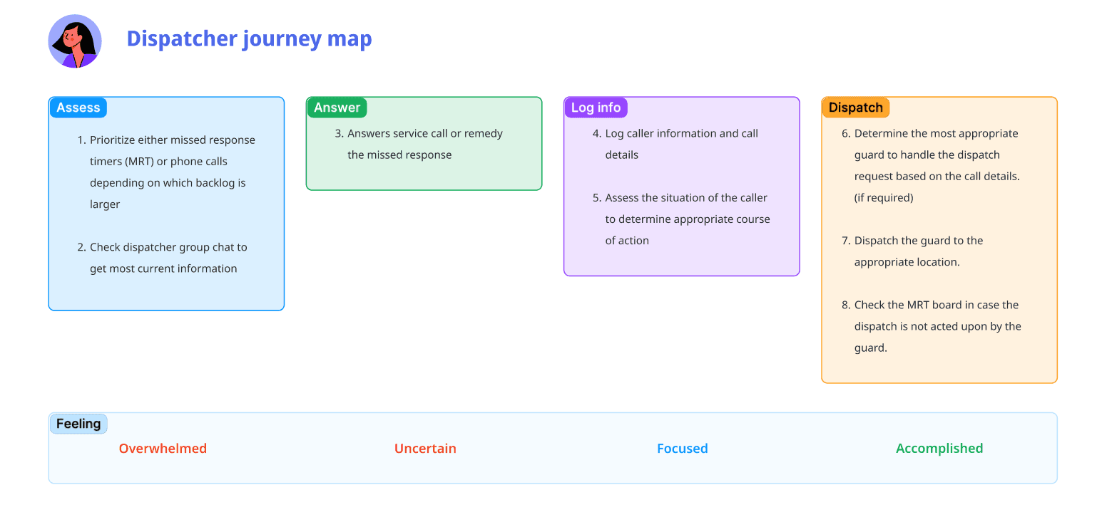
The Command Center
Improved efficiency, reduced frustration and a fresh coat of paint.

The product
TrackTik is a cloud-based security workforce management software designed to help security companies and departments manage their operations more efficiently. It has a very robust set of features including mobile dispatching and patrolling, scheduling, billing and payroll.
The goal
Mobile patrolling and dispatch were the main sources of income for the majority of our clients, so our first objective was to refine our mobile patrol and dispatch solutions to help security companies serve their clients better.
The methods
User interviews, on-site research, virtual co-creation sessions
Myself along with our Senior UX Researcher and Product Manager flew to the headquarters of four of our biggest clients to observe our users at work. In addition to this, we scheduled virtual user interviews with those same companies to speak with other users we could not meet in person.
Amongst those observed users were Franchise/business owners, dispatchers, operations managers and patrol officers
A focus on dispatchers
Dispatchers were our main focus for this research. They were the primary users of the dispatch features of our product, so we knew their input would be the most crucial to building quality dispatching software.
During our on-site visits we were given the opportunity to sit in the dispatch centers of some of our clients to view their dispatchers on the job which functioned as a form of informal usability test. We wanted to see which actions they performed the most and which features were the most crucial to their workflow. In addition to this, we also had some 1-on-1 interviews with dispatchers outside of their normal hours.
Fast-paced and high stress
Dispatchers are under a lot of pressure during their daily operations. They're required to make quick decisions while also being extremely thorough in the process. They often have calls on hold, as well as incoming alerts coming through the system via automatic alarm triggers, making it easy to be quickly overloaded with dispatch requests.
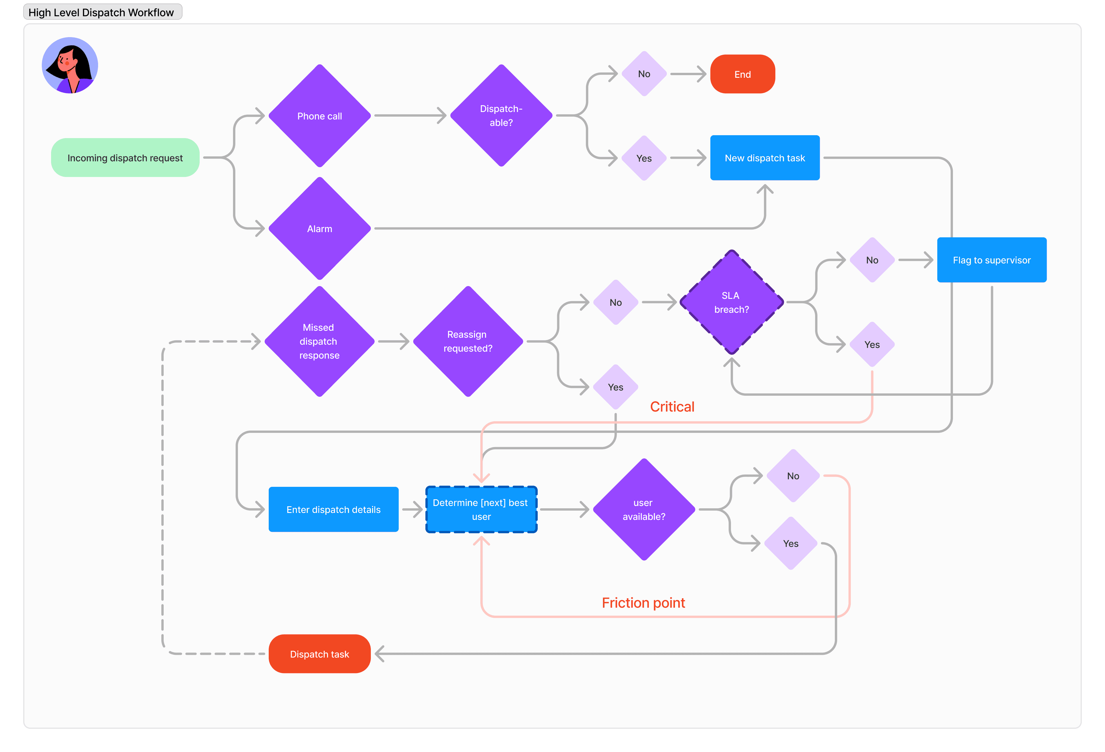
UX Artifacts
Mapping out the user journey helped us identify the most critical moments in the dispatch process and focus on the points where a user might experience the most friction or stress.
Reducing cognitive load
Unlike a dispatch center for 911 emergencies, security companies are more-often-than-not contacted by existing clients. Thanks to autofill, client details are pre-populated, saving dispatchers from needing to manually enter every detail. However, one point in the process that constantly requires critical thinking is selecting the appropriate security guard on the field to dispatch.
Dispatchers have to compare their guards' last-known locations against where they should be heading next in their patrol route in order to select the most appropriate option.
Is this guard's shift almost done? If so, who is the next best option? This can sometimes take up to 30 seconds and dispatchers will often be performing this all while still talking on the phone with the person on the other end of the line.
Truth is, we already had a solution in place to help our users with the decision-making process, but it was failing to meet our their expectations.
How might we facilitate decision making for dispatchers?
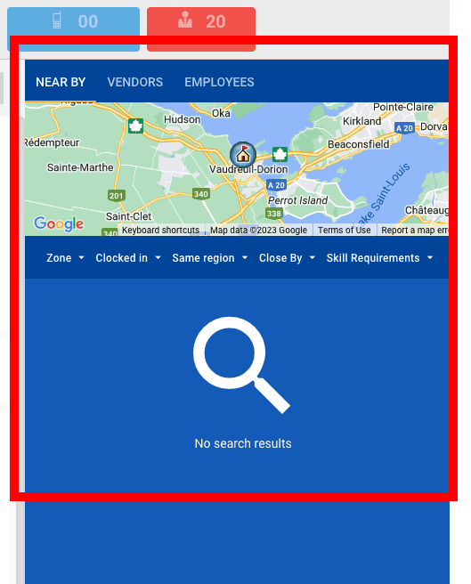
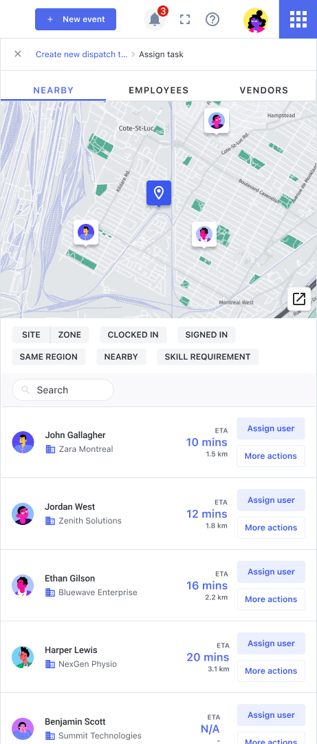
Improving the "Nearby" feature
This feature was meant to help dispatch operators select users who were nearby the dispatch site to save time. To our surprise, some of our users, even the team leads, were not using this feature in their workflow, and were instead resorting to calling the guards on the road, or were searching elsewhere in the application to get their locations, resulting in much longer dispatch times.
Our solutions
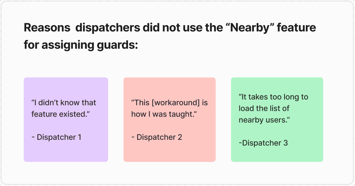
Problem #1
Users didn't know the feature was available/were trained with workarounds in place.
We learned that some users were never trained on using the "nearby" feature, while others knew about it but didn't incorporate it into their workflows. We couldn't gather the details as to why they weren't trained to use it, but others simply said they were trained to call guards on the field instead, presumably due to the unreliable nature of the current "nearby" list.
Solution
We chose to incorporate the "nearby" list directly within the dispatch workflow so users would spend less time time searching and guessing who the most appropriate user was.
On top of this, we gave the users the ability to see where a user was out in the field - because sometimes the measured distance isn't an accurate measurement of how long it will take someone to reach a destination when you factor in traffic, road closures, etc. This change empowered ours users to make informed decisions.
If the dispatcher wanted to view more details about a guard on duty, they could navigate to the user's profile to see their shift. This feature was on hold for the time being as it was a significant integration with our scheduling module, but was deemed a major quality-of-life improvement.
The UI was getting also a visual overhaul using a new front-end framework alongside the new workspace that we had in development (more on that later).
Problem #2
The list was taking too long to load after a user would choose their filters.
This was understandably a very frustrating issue when your job relies on efficiency. This resulted in users completely dismissing this feature altogether and relying on other means to find a suitable user for dispatching.
Solution
Given that this was more related to back-end architecture, we had discussions with our engineering team and they agreed to refine the process for the fetch requests on the back-end to make it more efficient.
After these adjustments load times were cut to an average of 2 seconds vs the 10-30 second load times we experienced with dispatchers on-site.
Problem #3
Information overload
With so many features being added to our product over the course of its lifespan, users were becoming frustrated by the complexity of the product. Dispatchers had to navigate through different interfaces that were completely unrelated to dispatching in order to access some of the information they needed. This wasn't news to us, as it had been brought up to us by our Client Success Managers who often receive feedback from our clients, but now we had heard it firsthand.
Solution
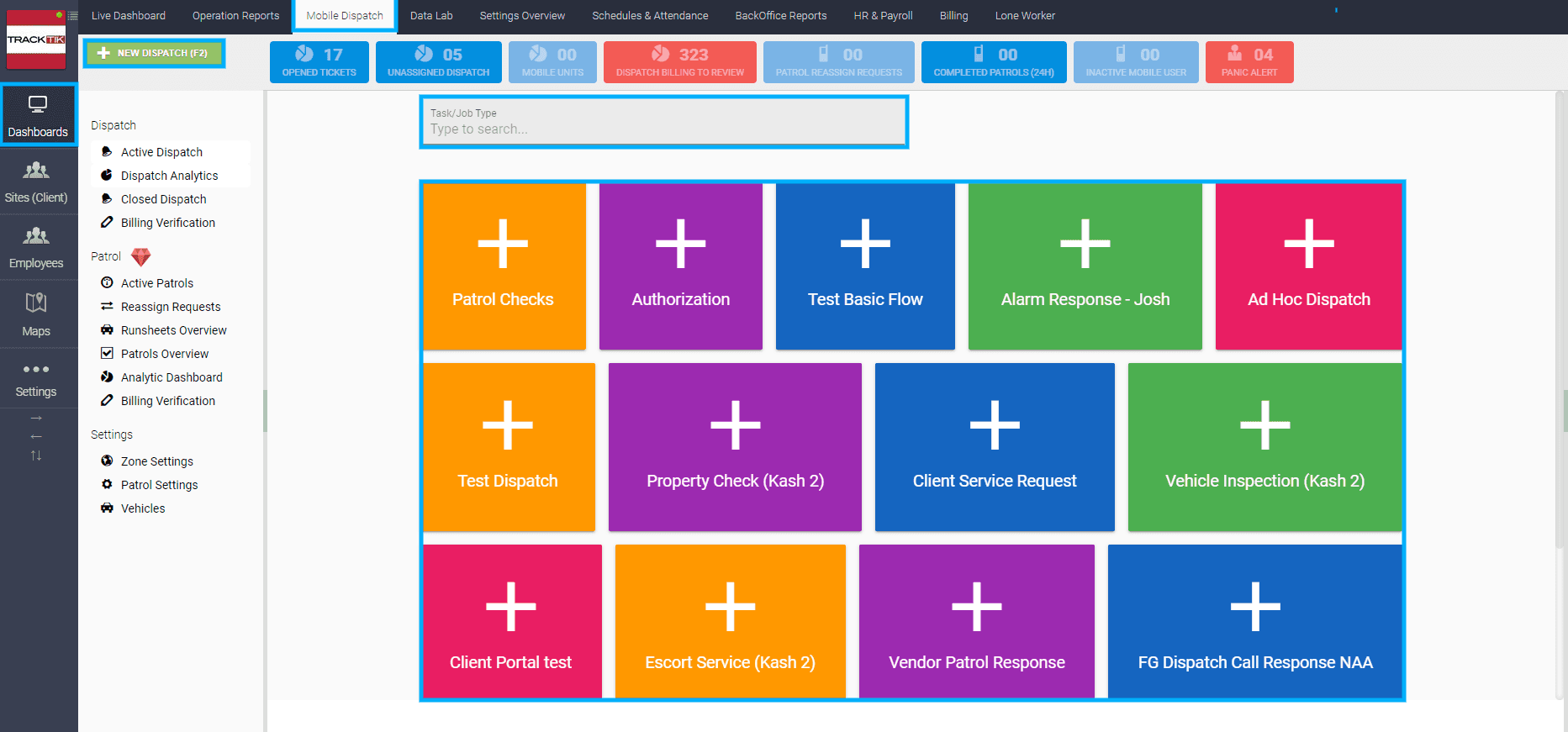
The idea was to move away from a "one-stop shop" approach and instead segment the different products into their own workspaces. Dispatchers would be able to have a dedicated dashboard, with everything pertaining to dispatch right in front of them. We were already leaning toward this option before our research, but our research further reinforced a dispatch workspace as the way forward.
New feature: Warning Trigger Table
The most critical tickets that needed to be addressed would be collected in the "Warning triggers" table. These tickets take priority over receiving new dispatch requests, as they could have legal or contractual obligations. Ultimately, these triggers would be defined by each company, along with default ticket types such as "SOS" triggers from a guard out in the field.
Revamped dispatch workflow
We changed the entire dispatch workflow from being a fullscreen, multi-page flow into a form that would fit in the side panel. The idea behind this was to maintain visibility on the Warning Triggers table, so emergencies could be noticed and dispatched immediately.
Before: Full screen actions
After: Consolidated to side panel

I used to make wireframes
You might have noticed that I've left out the wireframes from this project, and I want you to know there's a reason for that. Wireframes are useful when working on new design patterns, but that wasn't the case here. The company was building components using the Vuetify framework. Although the components were flexible, we generally leaned towards conservative design choices.
Additionally, during my time at TrackTik, I built a component library alongside my work. This allowed me to quickly prototype with assets from the library that would more accurately represent the end-product. This was not only useful for getting my squads excited for their upcoming work, but given the outdated UI that we had previously, it got a lot of our clients excited as well when we would show them the designs in co-creation sessions.
Instead of starting with wireframes, moving to low-fidelity prototypes, and then transitioning to high-fidelity, I used our existing design architecture and patterns to expedite the process. Designs were still iterated upon, and feedback was still taken into account, but this time my buttons were blue with 4px rounded corners instead of grey 0px, and sometimes it's the small things that make your job more enjoyable.

Learning to adapt
Something I had to come to terms with while working at this company is that the ideal process isn't always the one that plays out. The cyclical design process of define → research → ideate → design → prototype → test → iterate is the ideal process, but it wasn't the process that we were able to replicate.
My design team didn't have a Product Design Manager. At one point we did, but after a long string of departures and multiple rounds of layoffs, my team went from a group of 10 (6 designers, 2 researchers, and 2 content writers) down to a team of 4 (1 designer, 1 researcher, and 2 content writers). For over a year, I was the only product designer at my company of over 300 employees, reporting directly to the Chief Product Officer.
Advocating for design as the sole designer at my company was a full-time job in itself, and we didn't always have the support of management to push for more time for ideation or research. Deadlines were tight, customers were upset, and the product managers were stressed, so things would be labeled as "design dept" in a JIRA backlog somewhere, never to be seen again.
While the process was far from ideal, I continued to advocate for things like visibility of system status, contrast, color harmony, consistency standards, and error prevention—things that were more easily within my control. Celebrating the small wins became crucial in staying positive during challenging times.